


I was lucky enough to collar one of the lead designers for this very website to find out exactly how she came up with the colour schemes that bind it all together.
Johanna Drewe is design director of a company called Studio Output. She’s clever with colours and pictures and all that. Johanna and her design team had the extremely intricate task of colour-coordinating pottermore.com.
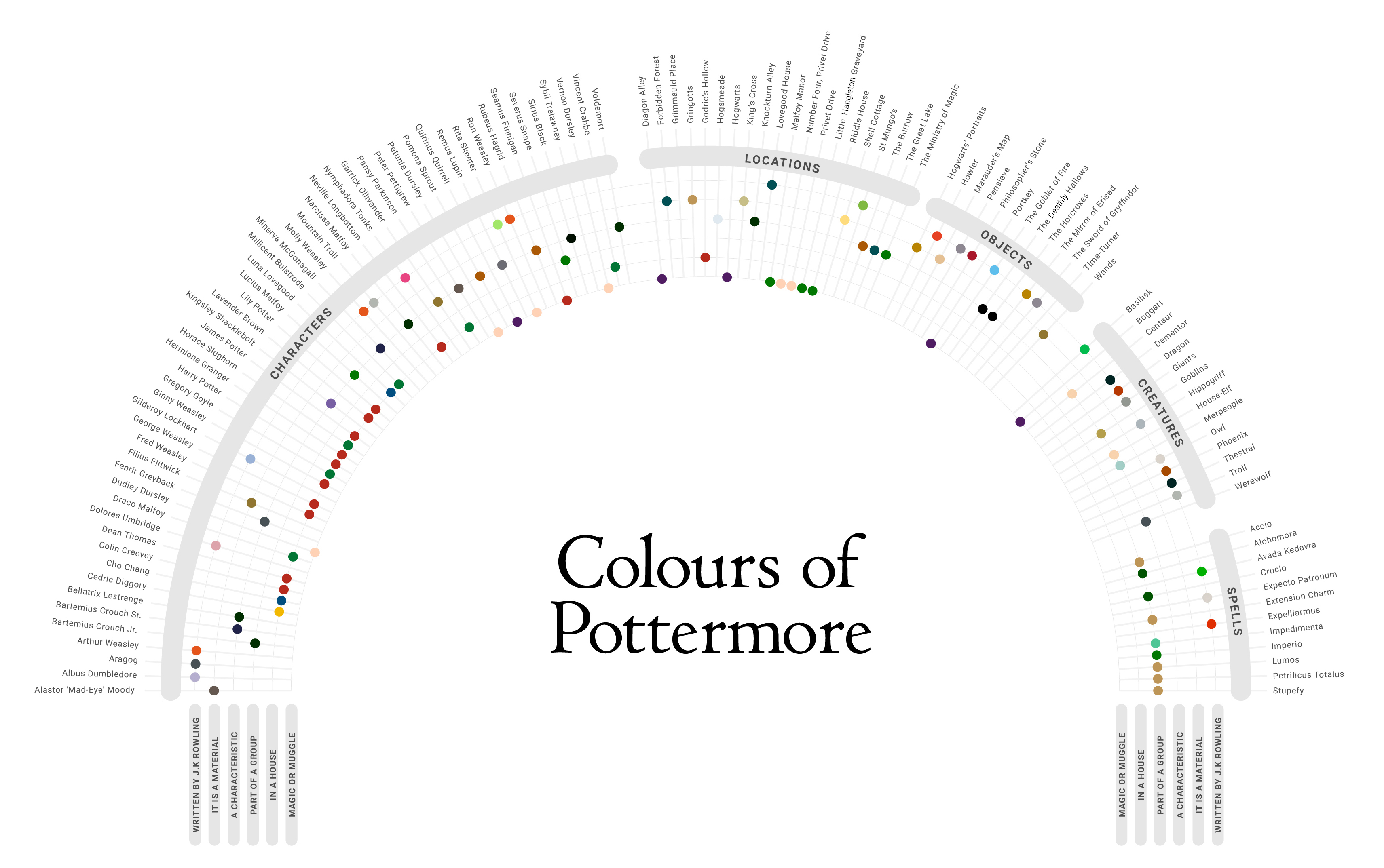
Now, it sounds simple: choosing which colour each page should be. There are only seven colours in the rainbow so just pick one, right? Not quite. What colour do you think Garrick Ollivander’s profile page should be? Or the one for Basilisks, King’s Cross or a Pensieve?
Take a good, long look at this colour wheel.
See full size

Not quite so simple, huh?
Getting the design right on something as beloved as the wizarding world is a meticulous business. Can you possibly imagine, for a moment, the delight and terror of such a task? It’s the kind of thing that calls for a clear, simple graph…

‘Obviously we had the books and films as incredible, rich references,’ Johanna tells us, ‘but it wasn’t always as easy as that. We made our decisions on colour by asking ourselves a series of questions, essentially a giant flow chart.
‘We realised pretty early on that some characters had an obvious colour. Some had many colours you could attribute to them and some had nothing distinguishable about them, or were featured too little in the books and films to have a colour specifically for them. By asking questions in levels we could arrive at a colour that was most relevant.
‘For example, the first question was: “Has it been described by J.K. Rowling either in the books or on pottermore.com?” If the answer was yes, then the specific colour is attributed. If the answer was no, we went on to ask: “Is it a material? Does it have a distinguishable character? Is it in a group? Does it have house allegiance?” Each of these answers led to a range of colours we had created.’
The priority, as always, was to stay true to J.K. Rowling’s vision.
How do you choose a colour for Harry Potter?
With some difficulty, as it turns out. And great caution.

‘The hardest characters to choose colours for were Harry, Ron and Hermione. Their importance made us feel they should be given their own specific colour but interestingly they aren’t really described as wearing any one colour in the book. And by picking just one, you are in danger of upsetting people,’ says Johanna, correctly identifying how mad we’d all be if Ron ended up with a brown page for no good reason at all.
‘For example Harry nearly always wears blue in the films, which I hadn’t noticed until we interviewed one of the costume designers, Laurent Guinci, and legendary production designer Stuart Craig, who designed the sets for all the Harry Potter films. Harry was almost sorted into Slytherin, but chose Gryffindor.
‘His life was dark and traumatic and he had a deep connection to Voldemort. Should he be in Gryffindor colours? Should he be blue, because he’s seen in it so often? Should he be green, because of the colour of his eyes or his connection with Voldemort?’
The decision was made: Harry ended up with a lovely Gryffindor-coloured page. Every Hogwarts student is matched with their house colour. You probably won’t be able to un-notice that now.
What about someone like Dolores Umbridge?
Some choices were a little more obvious than Harry, thankfully. You can probably guess how Dolores Umbridge got her colour.

‘Dolores Umbridge is described in the books as wearing a “pink fluffy cardigan” and is portrayed in the films in an ever-evolving shade of pink, growing deeper in tone as she grows in power,’ says Johanna. ‘She’s recognised as pink. Umbridge was the first character that made us really think about how important colour was across the site.’
Now, this next image might look as though Dolores has her own solar system, with her at the centre. She would have liked that. But really, this is simply a pretty constellation of answers from the flowchart we showed you earlier.

J.K. Rowling wrote Dolores in pink and that trumps all other factors. J.K. Rowling says she is pink, so pink she remains.
Designing for Dumbledore
How does one choose a colour for Albus Dumbledore? Is it yellow for his favourite sweet? Red for his old Hogwarts house? Grey for his beard? The answer comes straight from the mind of J.K. Rowling, like so many magical things.

‘J.K. Rowling has written before about the relevance of the colours green and purple, among others. Green is attributed to Dark magic, so that’s why our pages for the Horcruxes, any Dark spells and Slytherin house are green. Purple is attributed to noble, helpful magic. So the question became: “Is it noble or ignoble magic?”’
That’s why Dumbledore’s page is a delightful shade of purple. Not to mention how it would have brought out his eyes.
Why are the Dursleys such a delightful shade of peach?
So glad you asked. ‘The Dursley family all have the Muggle Beige palette,’ says Johanna, adding that the peachy flourishes came from J.K. Rowling when she wrote, ‘Colours like peach and salmon pink are distinctly un-magical, and therefore much favoured by the likes of Aunt Petunia.’ Nothing is an accident in this colour scheme, my friends. Nothing.
‘The Muggle Beige palette separates them from the magical world and by keeping the colour consistent across those characters they feel very uniform, plain and generic.’
You have our official permission to casually describe any nemeses you may have as ‘Muggle Beige’. You’ll find it quite satisfying. Not that I’ve tried it, or anything.
Anyway, here’s Dudders and his doting parents for your reference.

And his little solar system classification system.

Why’s Hagrid that orangey-red colour, then?
Because it’s the colour of love and Hagrid has a heart the size of the sun. Okay, fine. That’s not the real answer.

‘Hagrid’s name is derived from Alchemy, meaning red or passion, as written by J.K. Rowling,’ says Johanna. ‘So it made sense to attribute a red palette to him. The tone we picked was based on red then pushed to create a warmer, earthier tone, reflective of the character and the role he plays as gamekeeper at Hogwarts.’
And what about You-Know-Who?
Lord Voldemort is a menacing dark green. We’ve covered how green signifies nasty things and nasty people already, so you may have guessed this one.

So, there you have it: the colour scheme of the wizarding world. Spend enough time delving into pottermore.com and you’ll begin to realise what a mammoth and magical job it has been bringing Harry Potter’s world to life.
Bet you can’t look at a single page now without trying to guess the significance of each colour, either. Enjoy!
